by Scott McLeod @scottmcleod1996 Championships are an important part of Wrestling. A huge reason all wrestlers get into the business is to one day become a champion, for that moment when all the hard work was worth it; now you can call yourself champion! However, there are some titles that are so poorly designed that you wonder why anyone would want to wear them and this is not just in WWE but other major promotions! So here they are, my list of the 5 most disgusting, garish and generally ugly title designs in wrestling history! Honourable Mentions The Spinner Belt - It worked for Cena, and perhaps when Edge or Miz put their own spin (pun intended) on it. Having said that it looked stupid on everyone else, especially when Punk had to carry it for his 400+ day Championship reign. IWGP United States Heavyweight Championship. I didn’t like it when I first saw it but it’s growing on me. That front panel just seemed so clunky and messy! If you’re unfamiliar here is the belt in question:   5. TNA X-Division ChampionshipThis was a case of fixing what wasn’t broken in the first place! The original design was okay but TNA decided they had to rip off two WWE belts at once. This looks like if you put the X from the original NXT title and slammed it on top of the old Intercontinental Title. Not that TNA has ever tried to rip off WWE... They had an interesting idea where the champion could cash in the belt for a shot at the World title. To be honest, I’d cash it in just to not have to carry that belt anymore! It doesn’t get much better for the promotion as there is a worse TNA design which we’ll get to later!  4. Ring of Honor TV Championship [Original Version]The second design of this title also isn’t the best, but it’s made to look great by comparison to this first design which is atrocious! They seemed to focus a bit too much on the word Television when designing this belt, as it dominates the lacklustre front plate! Thank God they changed it before Jay Lethal’s record reign where he also won the world title! 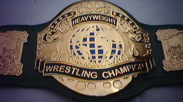 3. PWG Heavyweight ChampionshipNow I know PWG is a popular promotion, but we need to objectively look at their belt. First and foremost, it’s green which isn’t the best colour for a belt. Also, the plate design is incredibly basic! The Battle of Los Angles, from what I’ve seen, produces some of the most exciting indie matches in the world today with the winner earning a shot at this title. It might just be me, but I think it would be better if they were fighting for a shot at a more exciting looking title...maybe one that isn’t green?  2. WWE Diva’s ChampionshipI will never understand the decision to get rid of the Women’s title and keep this thing, it’s just so patronising to have Women carry around a belt that looks like a butterfly! It was made even worse when it was held by legitimate wrestlers like Charlotte, AJ Lee and Beth Phoenix. I like the designs of the RAW and SmackDown Women’s titles because they’re very similar to the world titles. That implies the women’s champions are on a par with the world champions in the men’s divisions. The divas title suggests the women aren’t as important, and we all know that just simply is not the case.  1. TNA World Heavyweight Championship [Jeff Hardy Immortal Design]Given the time frame in which this was created, it’s likely that Jeff Hardy was high when he came up with this design. The idea of a heel having their own personalised championship has been around for years, and is a great idea, but I don’t think it’s ever produced something so ugly. The stupidity of this belt was made even more evident when Jeff lost it to Sting. Watching the multiple time WCW champion briefly walking around with it was embarrassing! Hardy was the top heel at the time, but the thought of everyone clamouring to take this monstrosity from him is hard to buy.  What do you think? Do you like any of these designs or think there were some I missed? Tell me @scottmcleod1996 and make sure you follow Wrestling and More at @WAMPodcastUK
Comments are closed.
|
- Home
- PODCASTS
- REVIEWS
- PREDICTIONS & PREVIEWS
- COLUMNS & FEATURES
-
GAMING
- PWS WWE Universe Mode
- WWE Current Champions
- WWE Championship History
- WWE PPV Schedule
- PWS NJPW Universe Mode
- NJPW Current Champions
- NJPW Schedule
- King’s Road Wrestling
- King’s Road Wrestling Current Champions
- King’s Road Wrestling PPV Schedule
- King’s Road Wrestling Factions
- WWE2K PWG Battle of Los Angeles
- UFC PPV Simulations
- Rob Goodwin Career Mode
- Owzat Cricket Association T20 League
- CONTACT
Wrestling & More
 RSS Feed